Tiltify's campaign page shows a running total and a simple feed of recent donations. Support comes in surges, with certain moments driving far more activity than others. Nothing in the default view lets you see that shape, search the history, or understand what caused the spikes.
Start with a real-time feed and searchable history, then grow the scope incrementally based on what viewers actually wanted. Layer in analytics to surface when support spiked and what drove it. Build a journey section that goes beyond the numbers to capture the stories behind each day on the road.
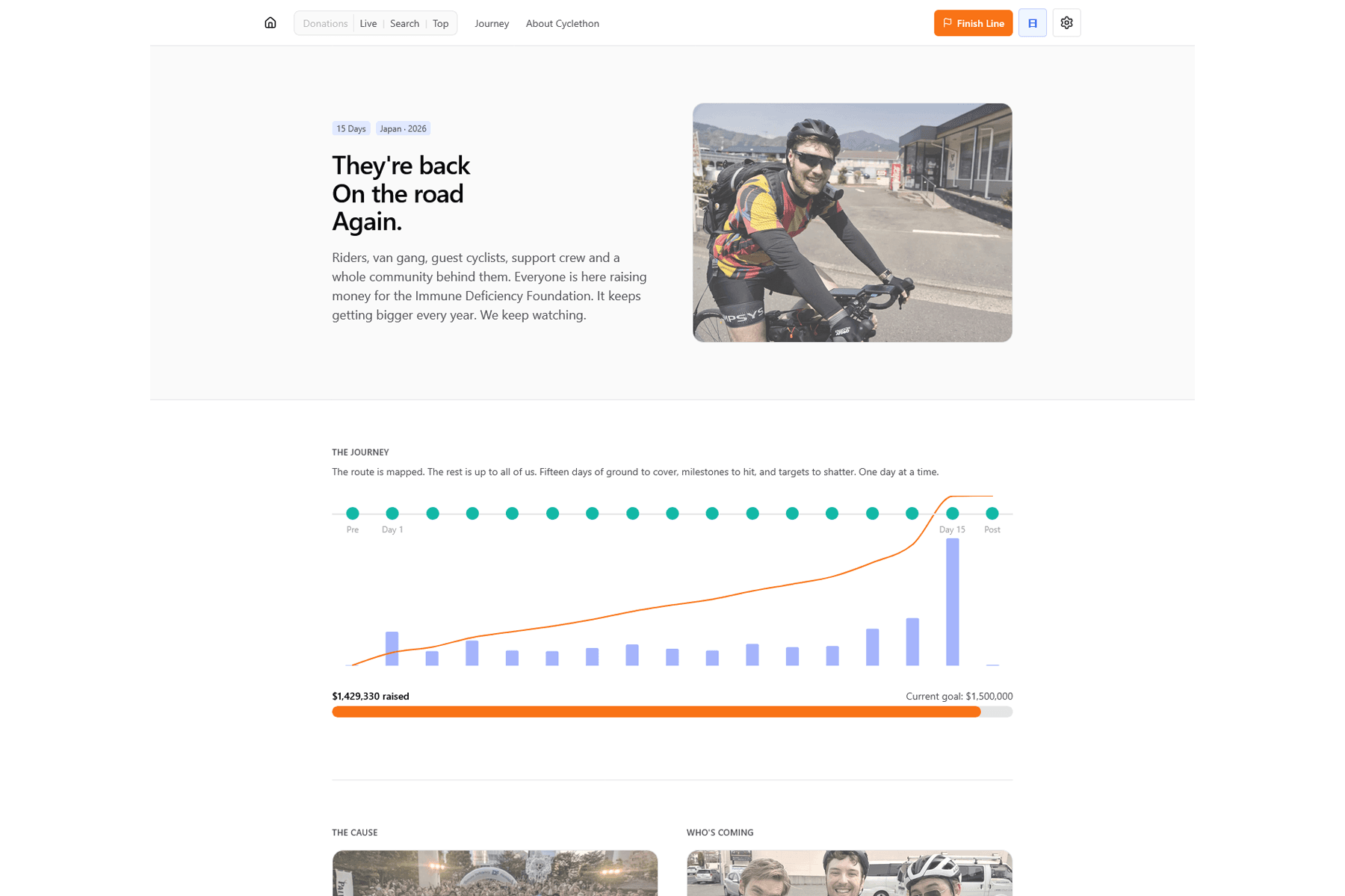
What started as a simple donation feed evolved into a full event companion over the 15 days. The journey section became a highlight, going beyond donation numbers to capture the story of each day on the road. A per-day donation trend chart would have made the rhythm of each day's support visible at a glance.
The real-time layer uses an in-memory EventEmitter to broadcast webhook events to SSE clients. On Vercel's serverless runtime this breaks across function instances. A lightweight pub/sub layer like Upstash Redis would make live delivery reliable at scale.